Great Ten #5 Page 11 creation animation:
from thumbnail to full color!
|
Great Ten #5 Page 11
This game discussion is going to simply focus on the visual storytelling of an action sequence.
The first four games presented a storytelling process that works very well for me. That process details the development of a page of art through four stages:
- Thumbnail
- Sketch
- Layout
- Finished Pencil
Integrated into this process is an initial, preparatory step: SCRIPT REVIEW, PHOTOGRAPHIC REFERENCE GATHERING and DESIGN WORK. Again, we won't worry about these things here.
If you are new to this party and would like to review this process in great detail, here are the passwords you will need to access the games that present it:
- Game Question #1 password: outlaw
- Game Question #2 password: Lhasa
- Game Question #3 password: duel
- Game Question #4 password: Shanghai
With this process under our belt, we can simply talk about visual storytelling.
|
 Script Script
|
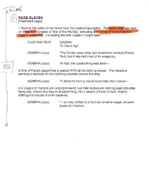
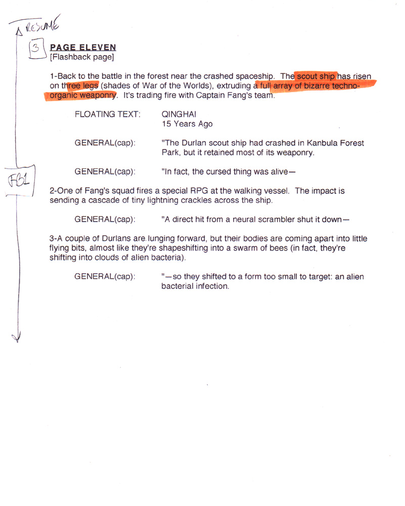
SCRIPT
Here is the script for this story page written by the excellent writer Tony Bedard. Read it over a few times, to make sure you understand the action occurring here.
PAGE CONTEXT
This page is part of a longer action sequence told in FLASHBACK. CAPTAIN FANG and his TEAM have approached the stationary ALIEN SHIP. Also, I designed a border treatment for ALL flashback sequences during the miniseries to clearly set apart the flashbacks from the preset day action.
Try to get a picture in your mind of the action occurring on this page, as if you are standing amidst the action.
If you can't quite form a mental image of the scene - that's OK! We're going to talk about ways to logically figure out a way to draw the page.
|
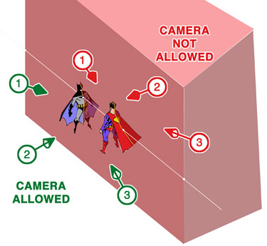
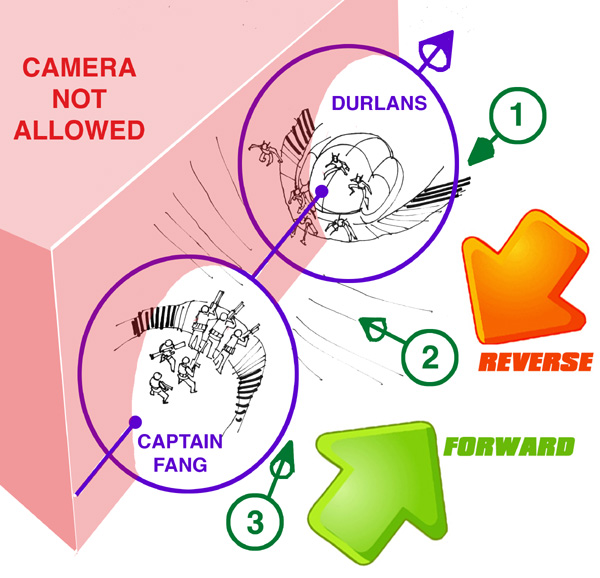
ACTION AXIS
Mouseover the numbered cameras above to see its view below.

|
ACTION AXIS
I learned of this technique in the book "The Five C's of Cinematography" by Joseph Mascelli. It's a book describing motion picture filming techniques, but this part applies directly to the static, sequential images we create as comic artists. I consider this technique to be absolutely necessary for proper visual storytelling.
The "action axis" in Mascelli's book is simply an imaginary line you place in your scene. If you keep all your camera angles on only one side of the action axis, then the relative position of characters and their direction of travel in your image will remain consistent. Managing relative position and direction of travel is absolutely essential to clear visual storytelling.
So how do you know where to put the line?
Generally speaking, basic applications of the action-axis are simply:
- the action-axis is an object's path of travel
- the action-axis intersects two interacting, stationary objects
Complex scenes can be simplified, easily broken down into combinations of these basic applications.
A few simple examples:
- For a scene that features one person, or a moving object like a car, this axis can define the "travel line" of the single character or object.
- For a scene that features two people arguing at the dinner table (seated and not moving), the axis becomes the line that intersects the two people.
- for a scene that features two (or more) people walking through a location, consider the cluster of people as one 'object' and the action axis as the path of travel of that one 'object.' Then, when you have to focus on the interaction of people within the cluster, separate them into two smaller groups that can have their own mini-action-axis.
- for a scene that features two large groups of people mixing (a football game, two armies fighting, two super-teams fighting), simplify: First, consider each large group as one 'object' and define the action axis as the line between the two 'objects.' Then, as you zoom in to focus on individual battles within the larger conflict, define two subgroups that can have its own action-axis.
In reality, the "action-axis" is a "line" only when considered from a top view. It's more accurate to think of the"action-axis" as an "action-plane." It is an invisible, imaginary, vertical "plane," or wall, that slices through the scene, stretching upwards to the stars and downwards through the earth.
Thus, for any camera angle you want to use (worm's eye, bird's eye, close-up, long-shot, or even a staged series of camera positions that spiral and zoom in any combination of vertical and lateral positions), keep ALL the camera positions on one side of the "plane" and the relative positions and direction of travel of objects in your scene will remain consistent.
One last note specifically to the comic artist: it is NOT acceptable to arbitrarily switch character positions on the page merely to simplify the placement of dialog and captions. If you MUST switch character positions, you MUST use a NEUTRAL or CROSSING shot. More on this later!
|
DIRECTION OF TRAVEL
|
DIRECTION OF TRAVEL
Direction of travel is a concept that must be properly managed to visually tell a story. It is intimately related to the "action-axis" discussed above.
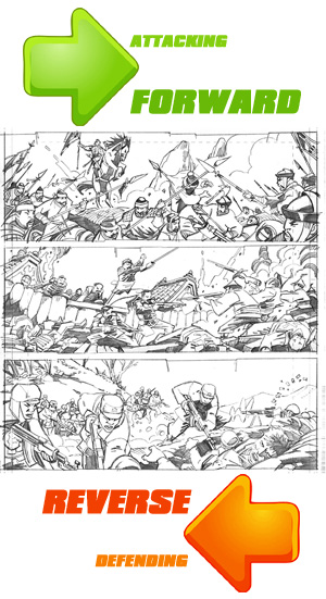
Forward travel is defined as moving from left-to-right, in the direction that we Westerners read. If you define a movement of a character to be from left-to-right, the subconscious perception is that he is moving "forward." If you define a movement that is right-to-left, the subconscious perception is that he is moving "backwards."
In comics, you'll want to use this concept to define the direction of motion. Usually, an offensive action (heroic or villainous) proceeds in the forward direction. Thus, when two forces fight,
- the "attacking" force should be given the "forward" direction of "left-to-right"
- the "defending" force should be assigned the reverse direction of "right-to-left."
It's easy to see examples of this principle in film and TV.
- In many Western films, when characters are headed from the east to the west, they are seen moving on screen from right-to-left because WEST on a map is to the LEFT.
- When a character travels from point A to B, he will move "forward" with left-to-right motion on the screen. Then, when he must race back from B to A, he will be seen traveling in the opposite direction, right-to-left on screen
- During a football game, if a camera on the opposite side of the stadium is used to show a replay or isolation, often you will see "REVERSE ANGLE" noted on-screen (because that camera has jumped the action-axis which runs between the two goal posts, reversing the on-screen direction of travel).
At this point I'll admit one frequent situation that violates these rules, and that is a conversation between two people sitting side by side in a moving vehicle. The more visually interesting action axis is defined through the two people, allowing for over-the-shoulder shots for each of the characters. However, this axis is perpendicular to the travel line of the car, so the apparent direction of travel will lurch back-and-forth as the camera goes from one OTS shot to the other. The lurching can be minimized by inserting a NEUTRAL shot between the shots that jump the action axis, but it is mostly just accepted in this case (the viewer is trained to understand that the people remain in their seats and the car remains travelling in the same direction UNLESS they are explicitly shown otherwise!).
|

NEUTRAL and CROSSING shot
|
NEUTRAL and CROSSING shots
These two classes of shots facilitate changes of travel direction and relative character positions. They are very useful in film and comics.
NEUTRAL
Used when the direction of travel must be reversed.
A "neutral" shot is one where the direction of travel is DIRECTLY TOWARD or DIRECTLY AWAY from the viewer. If you must change the direction of travel, use a neutral shot to show the direction change in progress.
CROSSING
Used when the relative position of on-screen characters must be reversed.
A "crossing" shot is one where the characters are literally seen crossing. If you must flip the relative position of the characters on-screen, use a crossing shot to show the flip in progress.
|
Location Sketch
|
LOCATION SKETCH
Often it can be very helpful to quickly sketch out the situation you have to draw: the location, and the relative position of the characters to the location and each other. Simply think of this sketch as a little diorama - those little 3D models of historical scenes many of us made in school.
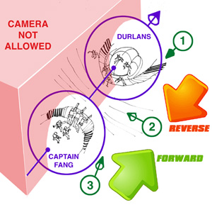
Recall that CAPTAIN FANG and his MILITARY TEAM have travelled to the location of the crashed DURLAN SHIP. CAPTAIN FANG is moving FORWARD in the story, thus I assign him the FORWARD left-to-right direction. Consequently, the DURLAN ALIENS will be defending in the REVERSE right-to-left direction.
Notice that I grouped FANG'S TEAM into one element, and I grouped the DURLANS into another element. Then, the action-axis is simply the line that connects these two elements.
Because I have assigned FANG to move LEFT-TO-RIGHT, the cameras MUST be on the clear side of the action axis. Everything on the other side of the action-axis (marked in RED) is a NO GO ZONE for the cameras!
Now all that remains is to choose camera locations. I spotted 3 general locations:
- CAMERA 1: View of FANG over-the-shoulder (OTS) of the DURLANS.
- CAMERA 2: Lateral view of FANG and the DURLANS.
- CAMERA 3: View of the DURLANS over-the-shoulder (OTS) of FANG.
Of course, there are an infinite number of locations, but I picked 3 significantly different camera locations to start the evaluation.
Now comes the part where you get to make choices! There are plenty of ways to draw this page correctly, but use your creativity and judgment to find a way that works best for YOU.
|
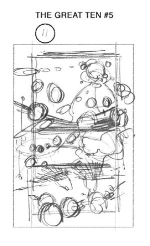
Step 1 - thumbnail
|
STEP 1 - THUMBNAIL
PAGE COMPOSITION
I always judge the story content on the page and attempt to rank the panels in terms of story and visual priority. The most significant panel will be the largest on the page, the least significant panel will be the smallest on the page, and the other panels are ranked relative to the rest and will be sized accordingly. This approach visually reinforces the story "beats," the pulse of the written story as it proceeds across all the pages.
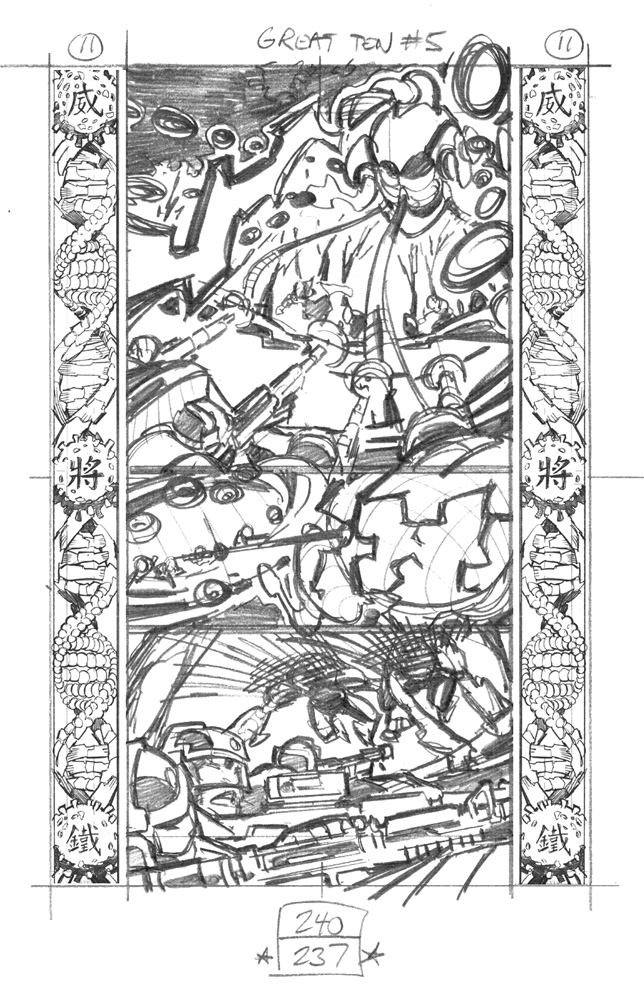
- I judged PANEL 1 to contain the most SIGNIFICANT story (the DURLANS markedly increase their violence), thus it will be the largest image on the page.
- I judged PANEL 3 to be the second most significant panel as it is a perfect page-turner set-up for their newest, most horrific attack (transforming into a virus).
- This leaves PANEL 2 to represent the least significant story point on the page, and thus the smallest panel on the page.
PANEL 1
Initially, I thought it might be most dramatic to view FANG OTS of the DURLANS (Camera 1). This would place the DURLAN SHIP in the extreme foreground, and FANG in the background. As interesting as this is, this view:
- doesn't communicate to the viewer that the DURLAN SHIP has "stood up" on it's 3 legs
- doesn't communicate to the viewer the sheer size differential between the humans and the alien ship (because the ship is so close to the camera).
Next I considered viewing this shot using Camera 3 (view of the DURLANS OTS of FANG). This shot had a lot of positives:
- the active object is facing the reader (the DURLAN SHIP firing)
- we clearly see the SHIP standing up
- we clearly see the size relation of the SHIP to the nearby DURLANS (and, hence, the size relation of the SHIP to FANG.
After considering these two views, it became clear that this shot is best viewed by Camera 3.
PANEL 2
Now that the first shot is selected, the second shot is easy: Use Camera 1. Why?
- the active object is facing the reader (the SOLDIER firing his RPG)
- the EFFECT of the RPG strike is up close for the viewer to see: the LIGHTNING crackling across the DURLAN SHIP HULL.
- using the companion OTS shot from panel 1 adds energy and movement to the scene
- generally, we do NOT repeat the same camera angle in consecutive panels when the action is occurring so rapidly
PANEL 3
Because the DURLANS are swarming FANG'S TEAM, the two groups are mixing positions. However, we still maintain order by following our established areas for the camera.
This shot could easily have been viewed by Camera 3 (same as PANEL 1). The advancing DURLANS could be seen coming toward the reader. This view, however, wouldn't communicate to the viewer that FANG is becoming surrounded.
Viewing this shot from Camera 2 (the LATERAL view) also has the advancing DURLANS coming toward the reader, but we also communicate to the viewer that the DURLANS are swarming around FANG'S TEAM. I judged this view to be superior.
THAT'S IT! All the STORYTELLING CHOICES are made - now it's time to IMPLEMENT those CHOICES!
|
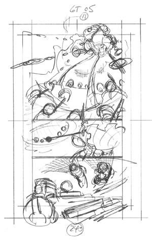
Step 2 - sketch
|
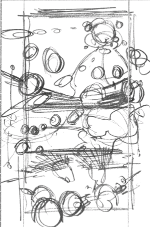
STEP 2 - SKETCH
Once the thumbnail composition is chosen, it is enlarged and it becomes the foundation for this next stage - the sketch stage. To find out the actual sizes of each of these steps, see the Great Ten Game Questions # 1 - 4!
Begin to flesh out the shots, adding the needed cylinder body forms and structural shapes. Stay loose, and try to capture the energy of gesture drawings. We'll tighten things up in the next stage!
|

Step 3 - layout
|
STEP 3 - LAYOUT
Here's the page layout, developed directly from the sketch completed in the previous step.
Tighten up the figure anatomy, and settle the shot cropping. Make it as tight or as loose as you need to work effectively at full size in the next (final) stage.
I prefer to spot shadows too, so I can gauge the weight of the positive and negative spaces on the page. But, again, include what YOU need.
|
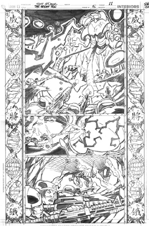
Step 4 - finished pencils
|
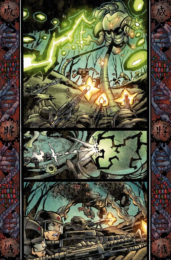
STEP 4 - FINISHED PENCILS!
This is it - the very last thing to do is to apply the last touch of surface details to the work in progress! Many people think that the technical process of drawing - ie, pushing a pencil across the bristol board - is all we do! Actually, it's the LAST task in a long chain of design, choice and refinement!
Note in PANEL 3 I rendered the DURLANS transforming into VIRUS PARTICLES as cross-hatching. I simply asked inker Andy Owens to render this area as SPLATTER, thicker closer to the DURLAN BODY, thinning as it disperses away from the body. And he did a grea job! Some things are simply easier to do in ink than in pencil!
Work very hard to get your best efforts down onto the paper as effectively and as efficiently as you can - THEN MOVE ONTO THE NEXT PAGE! Remember, this is art created for PUBLICATION, and that means there are very real deadlines to meet!
|
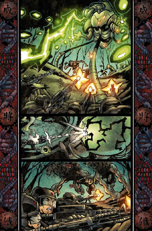
The finished product!
|
THE FINISHED PRODUCT!
The stunning color art was rendered by Tanya and Rich Horie.
The strong inking was provided by Andy Owens.
|
 Script