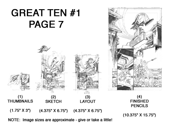
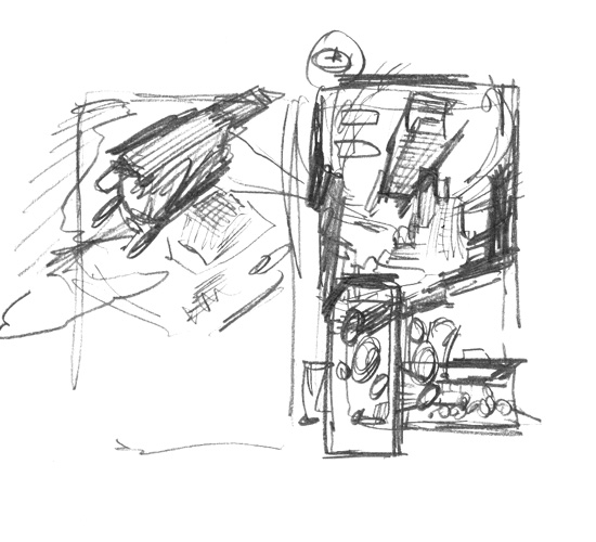
The steps taken to create Great Ten #1 Page 7!

I really enjoyed working on this page, and I thought it would make a good example to share all the steps taken to create it!

I have found that this 4-step process works very well for me. I compare it to sculpting: I start with the most general, overall shapes and sizes, and progressively refine the detail in stages to arrive at the final image.

All the energy and work involved in each step is not wasted. Quite the contrary. By working on a lightbox, each step taken becomes the foundation for the next step. Nothing is wasted!

I also thought it helpful (for all those aspiring artists out there!) to show the relative sizes of each of the steps. Each comic page I create follows these same 4 steps - and each comic page I create begins with very small thumbnails!

Onto Step 1 !


Starting place: Script
STARTING PLACE: SCRIPT

Every page starts with a script! After all, the comic book artist is first and foremost a storyteller, so it is only proper to begin with the story!

We've all read a novel. When we become engrossed in the story, we lose track of the mechanical process of reading (eyes moving left-to-right, top-to-bottom) and images begin to take shape in our minds. Descriptive and clear text inspires sharp and clear pictures in our minds. In simple terms, that is the job of the comic book artist: to read the script, allow those images to form in our mind's eye, then scramble to get them down onto paper for further analysis and refinement.

Presented for your review is the script for this story page written by the excellent writer Tony Bedard. Read it over a few times, to make sure you understand the action occurring here. Just a few notes on my markings:

  • The boxed number in the upper left corner. That is simply the number of panels on the page. It helps to understand the density of images required by the page.
  • The pencil oval and note. A common occurrence for me - often each story page will have numerous notes in the margins! Whether a question, an inspiration for an idea, a clarification, etc., these notes are meant to sharpen my understanding of the story or immediate "initial reactions" to story points that should influence the art.
  • The Pink/Purple highlights. These indicate REFERENCE items that need to be researched.
  • The Orange highlights. These indicate DESIGN items.
  • I'll use Yellow highlights to indicate page composition information (like a notation that an image is a SPLASH, or a panel is an INSET, etc.)
  • I'll use Green highlights to tag text that is to be integrated in the lineart (like text on a TV screen, or specific markings/signage on a building).

Normally, I read the entire script several times (at least 3 times) to make sure I understand the story, and to identify any opportunities to try something visually creative. This is the stage where I decided to create a formal, recurring design concept for the flashback pages that appear in every issue, and to create a recurring design concept for the opening splash page. There are other opportunities to create visual mirrors within a single story, too. All this structural consideration is possible by doing a script study before a single line is drawn!

Furthermore, I usually do the bulk of the reference research and design work for the entire issue before drawing the first line! Each piece of missing reference or incomplete design creates a "gap" in the information needed to properly tell a story. I find that I work better if I close as many gaps as practical before drawing that first line.

So onto what I'll call STAGE 0 - the design work and reference gathering effort!


STEP 0 - DESIGN AND REFERENCE

Every page requires some level of design and reference. As the story unfolds, new characters and objects and locations are constantly presented, and the artist must be able to manage all these visual requirements.

In fact, I spent nearly 3 full weeks just acquiring photographic reference and doing all the needed design work just for issue #1 !


Great Ten Flying Base


Lao Qigong

DESIGN

Each story will feature objects never-before-seen, and it is the penciller's job to create the visual for these objects. In this story, there was a LOT of characters and objects to design! On just this one page we see the Great Ten's Flying Base for the first time, as well as the look of the Lao Qigong adherents!

At left are my design sheets for the Flying Base and Lao Qigong.


Potala Palace

Lhasa Streets

Chinese Police
REFERENCE

Each story will feature real objects or locations that need to be portrayed accurately, and the artist must arm himself with sufficient photographic reference to enable articulation of those objects or locations. On just this one page we have Potala Palace and Lhasa and Chinese riot police all appear.

At left you'll find samples of reference sheets I assemble for my working reference library. For issue #1 alone I created over 100 such reference sheets!


Step 1 - thumbnail sketches
STEP 1 - THUMBNAILS

Every single page I create begins as a set of small thumbnail sketches!

The point of the thumbnail image is to capture the large-scale information of the page:

  • Overall page composition (eye flow across the panels)
  • Selection of camera angles

That's it! Don't focus on the actual object details at this point - only on the ELEMENT PLACEMENTS and the RELATIONSHIPS BETWEEN ELEMENTS.

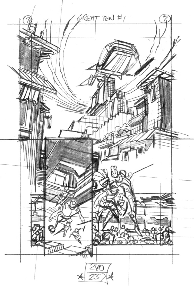
You can see I worked two thumbnails here. Sometimes I "see" the written page clearly and I have a pretty solid idea of how I'd like the page to be designed with one good thumbnail. However, there are plenty of other times when I "see" a blizzard of competing ideas that have to be somehow distilled and analyzed. The thumbnail sketch is a very quick way to test / examine ideas to find the ones that work and the ones that don't.

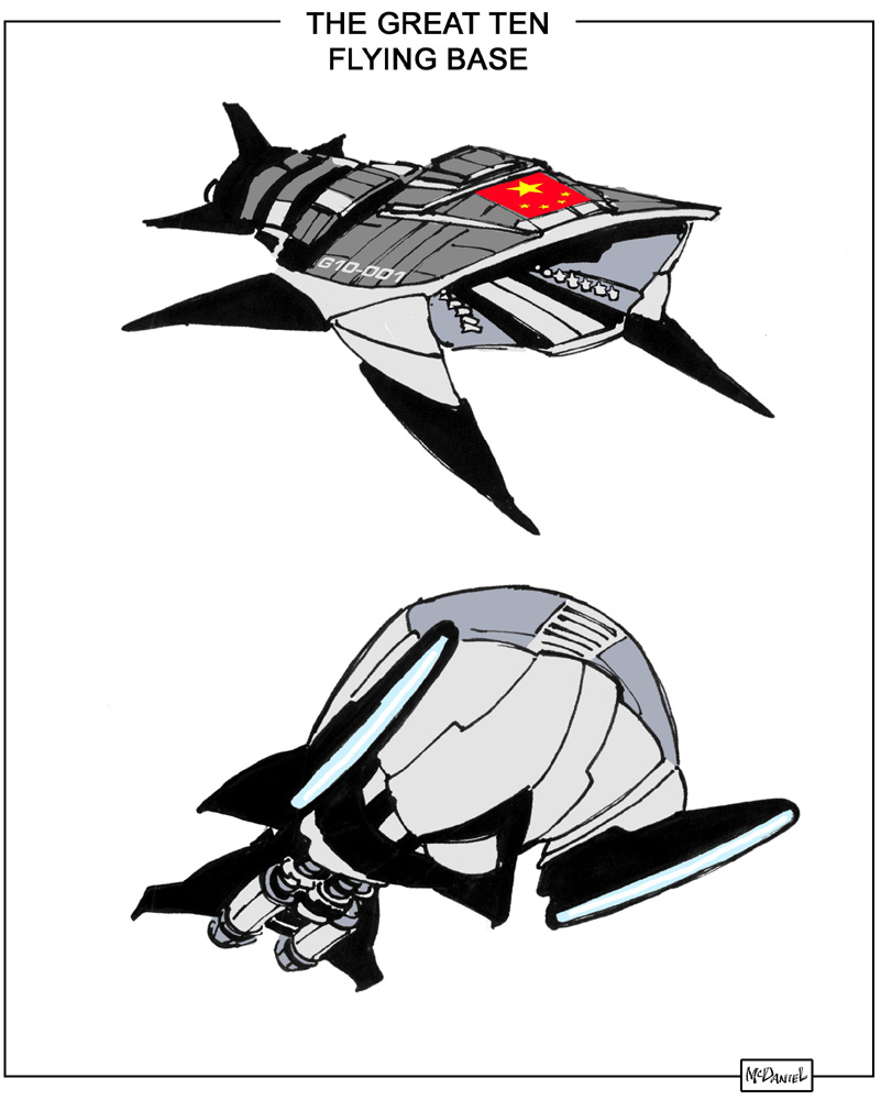
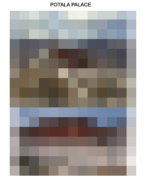
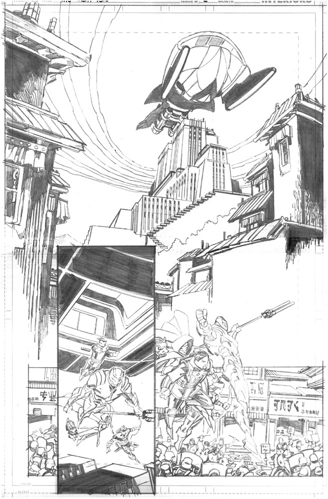
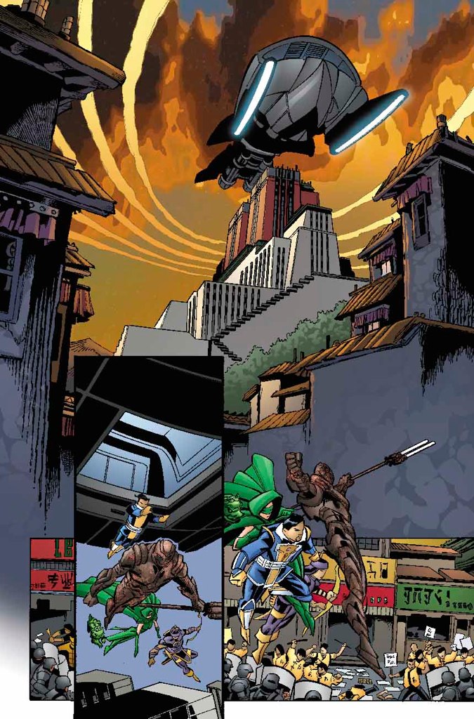
I always begin page composition by trying to identify the strongest, most dramatic moment that occurs on the page. If one moment seems strongest, it becomes the dominant image on the page and all other images become subservient to it. Upon studying this page, I determined that panel 1's arrival of the massive ship over the historic Palace was the big dramatic start of the sequence. Panel 1 would dominate the page, and panels 2-3 would be designed to complement it.

I began with the first panel being a down shot, the camera above the flying base ship looking down to Potala Palace. Several problems immediately became apparent:

  • In order to view the flying base from the front, this image would have to be mirrored (which is easy, and preserves the more natural LEFT-to-RIGHT advancing direction of the ship).
  • More significantly, there is a problem establishing the true size of the ship, the true size of the palace, and their sizes relative to each other. Any foreground object will appear large, and this angle makes it very difficult for the reader to understand just how massive each object truly is.
  • The camera is placed very high in the sky - not a natural position of an onlooker. The typical person cannot view events from this angle, and it misses the opportunity to capture a 'man-on-the-street' perspective.

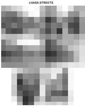
I then jumped to thumbnail #2, which was a shot from the streets of Lhasa. All the problems mentioned above disappeared, and the added benefit of capturing the flavor of local Lhasa architecture was realized. For all these reasons, this second thumbnail sketch is the better choice for panel 1.

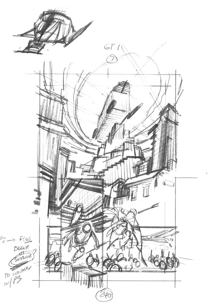
Panel 2 always "read" in my mind as a vertical panel. It needed height to execute properly, showing our heroes descending out of the flying ship.

Panel 3 always "read" in my mind as a horizontal panel. It needed width to execute properly, a wide shot to show the developing melee in the common area.

Thus, with these constraints, the placement of the panels on the page became pretty clear.


Step 2 - sketch
STEP 2 - SKETCH

Once the thumbnail image is chosen, it is enlarged to the size shown above (which is nearly the size of the printed comic) and it becomes the foundation for this next sketch stage.

The point of the sketch stage is to begin to develop the structural detail underlying the drawing:

  • Capture the energy of fluid gestures and motions (of both objects and locations)
  • Rough in the perspective required to implement the shot
  • Develop the figures as cylinder bodies, capturing body language gestures, body line, figure balance and relative sizes throughout the shot
  • Accommodate sufficient space for all text (dialogue, captions and sound effects) required in each shot
  • Manage the proper flow of text WHILE maintaining proper storytelling rules.

At this stage the RELATIONSHIPS BETWEEN ELEMENTS are maintained and the elements themselves begin to take on the appropriate structures.

Panel 1:

    The form of the ship over the form of the Palace. Note that every object is contained in the same perspective system, unifying the 3 distinct planes in the shot (extreme foreground Lhasa street, midground Palace, background Flying ship and sky).

    Note also the energy given to the sky by the cloud features. At this point I was considering 2 options: (1) the concentric ripples of clouds (as if the Flying Ship were dropping from a high altitude like a stone into water), and (2) streaming high altitude clouds. Both are present here for consideration.

    I wanted this shot to feel large and uncontained, so I decided to drop the border. The separation of this shot would be accomplished by simply bleeding out the lineart and leaving sufficient space to create a strong negative space around panel 3.

Figures in panels 2-3:

    The figures in panels 2 & 3 were too close to the same size, looking as if they were part of the same action. To increase the contrast in figure sizes, I could:
    • reduce the figure sizes in panel 2
    • increase the figure sizes in panel 3

    I chose the former, as the latter seemed to bring panel 3 figures too far away from the melee and it brought the figures into contact with panel 1, a contact that violated the neg space buffer and confused the eyeflow across the page.

    Last - managing dialogue. While not a concern on this page, the penciller MUST be able to manage the order of dialogue WHILE maintaining proper storytelling. You must block out the entire sequence, select the action axis and direction of travel, then work very hard to make sure the written order of dialogue can be clearly integrated with the line art. It is NOT professional to simply flip character positions or directions simply to accommodate a challenging order of dialogue! The art and text should fit together like a hand in a glove! But, again, this isn't a problem here as this page features a whopping 4 captions!


Step 3 - layout
STEP 3 - LAYOUT

Here's the page layout, developed directly from the sketch completed in the previous step.

The point of the layout stage is to lock down enough structural and lighting detail to guide the full size rendering of the next (and last) stage:

  • Formalize the perspective, providing sufficient guide lines to interpolate at the next stage
  • Settle figure articulation
  • Rough in areas of light/shade, to ensure proper balance of positive and negative spaces (or to identify areas needing more clarity and separation).
  • Maintain sufficient space for all required text.

Perspective is an absolute necessity in visual storytelling, and it is far easier to manage vanishing points at a smaller scale than it is at full size. At the size of the layouts shown above, vp's commonly fall less than 24" from the image area. This distance is easy to reach on a drawing board with a handy ruler and extra paper taped to the layout. The vp's can be easily modified to find just the right distance to look "right" on the page.

NOTE - I have a rather large tutorial on perspective in the DRAWING COMICS section of the site! Check it out if you are interested in a more thorough discussion of the different perspective systems!

The layout now contains a great deal of design and structural information. The last thing left to do - apply the surface rendering!


Step 4 - finished pencils
STEP 4 - FINISHED PENCILS!

This is it - the very last thing to do is to apply the last touch of surface details to the work in progress! Many people think that the technical process of drawing - ie, pushing a pencil across the bristol board - is all we do! Actually, it's the LAST task in a long chain of design, choice and refinement!

The point of the finished pencil stage is to implement all the design, choice and refinement of the previous 3 steps:

  • Render as cleanly as possible the objects in the shot so the inker has the clearest idea of what you want.
  • Choose the detail to enhance / include, and choose the detail to reduce/ eliminate. Artistic license is needed to focus the reader's eye to the areas of interest in the shot, and to steer the reader's eye across the page.
  • Maintain sufficient positive and negative spaces, and a sufficient balance of light / shade.
  • Make sure the image is consistent and proper for your style - identify any lingering problem areas and correct them as best you can.


The finished product!
THE FINISHED PRODUCT!

This stunning color art was rendered by Tanya and Rich Horie - and as great as it looks in print, I felt you just HAD to see the (albeit low res) source jpeg!

And let's not forget the contribution of inker-extraordinaire Andy Owens!