
Click thumb to open larger version in new window!
|
Sketches A&B
|
I start off unsure whether to literally show Superman on the cover, or to thematically represent him. No matter the approach, the goal is to end up with a very arresting visual that features Superman and Nightwing.
Now, literally representing Superman diverts attention away from Nightwing (the star of the book). So, care must be taken so that one does not exceedingly overshadow the other.
But, representing Superman thematically is less likely to be successful in catching Superman fans' eyes to this book. The benefit is that Nightwing is going to be very dominant on the cover.
Sketch A features the boys in action in Bludhaven, Nightwing leaping through an opening in a wall caused by Superman's heat vision. Not a bad start - it shows teamwork. But it seems to be missing some punch.
Sketch B shows Nightwing confident in the security Superman provides him, as represented in the cape. It's an interesting idea, but he looks more like he's snuggling a soft towel after a bubble-bath, definitely NOT the impression of the rugged crime-fighter I was trying to achieve!
|
|

Click thumb to open larger version in new window!
|
Sketches C&D
|
Again, I try again to represent Superman thematically, not literally.
Sketch C shows Nightwing caught in Superman's shadow, as Superman burns his symbol into the ground around Nightwing. Why? Beats me - that's probably why we didn't go with this one!
Sketch D features Nightwing backed against a brick wall, caught in a spotlight. Off screen Superman is burning his emblem around Nightwing. Again, we must ask "Why did I do that?" Again, I say "Beats me." Although this one looks pretty neat, it doesn't make too much sense.
|
|
Click thumb to open larger version in new window!
|
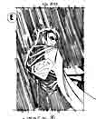
Sketch E
|
This one is a variant of sketch B.
Much more moody, this sketch tries to convey the feeling that Nightwing is under Superman's protection, not only from the night and the elements, but from implied other dangers. It's not a bad concept, but the image is more moody than arresting. And we are trying to make an arresting cover, so on we go.
|
|
Click thumb to open larger version in new window!
|
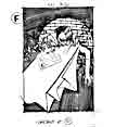
Sketch F
|
This one is a variant of sketch D.
Here Nightwing is shown to be under Superman's protection, from the night and the obvious dangers of fighting crime. But, do you know the glaringly obvious reason why this concept absolutely cannot work?? Superman's cape (and the rest of his costume for that matter) is not invulnerable UNLESS it is in direct contact with his skin.
Who knew???
Obviously, I didn't, because I did the sketch in the first place. Arrgh. Oh well, onward, and upward.....
|
|
Click thumb to open larger version in new window!
|
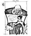
Sketch G
|
This sketch is reminiscent of a scene in the story where Superman backs up Nightwing as he confronts the Bludhaven crime boss Blockbuster (the one with the rather large head).
By now, you're saying to me "But Scott, EVERYBODY knows that Superman's cape is not invulnerable and super-strong when it is not in direct contact with his skin! Blockbuster could EASILY break that bond and pound Nightwing into apple cider!"
Yeah, yeah, yeah. Where were you when I needed you...?!
Onward and upward...
|
|
Click thumb to open larger version in new window!
|
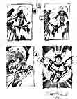
Sketches H-K
|
Well, by now I cave in and actually, literally, represent Superman in the cover concepts.
Sketch H shows the boys in patrol over Bludhaven city. Notice the difference in body language - Superman is very stiff and powerful (almost godlike) and Nightwing is acrobatic and lithe. Get it - a dichotomy! (That's the new word for the day, boys and girls!).
Sketch I is simply a variant on the concept H, except with a different point-of-view (pov).
Sketch J literally shows Nightwing in the direct protection of Superman. Superman is deflecting a barrage of bullets fired from off-screen bad-guys, Nightwing confident in his little sliver of protection. This one is looking like the front runner for the cover illustration.
Sketch K is more like a pin-up, a fun image of the characters with no real theme behind it. Although it looks pretty cool, this idea has been done, oh, about a gazillion times before, and we do want to be original.....
|
|
Click thumb to open larger version in new window!
|
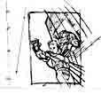
Second Round Sketch A
|
Well, we made it to the second round! The editors and I seemed to like concept "J" the most, so let's try to refine it a little.
This sketch was done to study the perspective of the shot. That work was done on an overlay (simply another sheet), that I don't show here. Why? Because a fella has to have SOME trade secrets! I'll just say that its the curvilinear perspective work, that uses 5-point perspective. Yup - I mean FIVE points - and I used them all!
|
|

Click thumb to open larger version in new window!
|
Layout
|
This sketch is the actual layout I used to draw the cover, making use of the perspective study of the previous sketch.
This drawing is roughly 4.375" x 6.75" . I enlarged it 232% to get it to full size (roughly 10.375" x 15.625"). I taped the enlarged layout to the back of an illustration board and completed the final pencils (see next sketch!!) on my lightbox.
|
|
Click thumb to open larger version in new window!
|
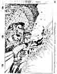
Pencils
|
This is it - the culmination of all our work! Pretty cool, eh?
I rendered this art on Bristol board, using a 0.7mm mechanical pencil with 2H lead. As mentioned earlier, the enlarged layout was taped to the back of the Bristol board, and the final linework was done over a lightbox.
I prefer to work on a lightbox for lots of different reasons, but for this specific task it gives tremendous control over composition and cropping, as well as giving the final pencils a very crisp and clean look (which helps the inker do his job!).
(By the way, this picture is a scan of a reduced photocopy, and not a very good photocopy at that. Sadly, I didn't make a scan of the pencil art before it was inked.)
|
|

