Nightwing Medium Statue Design
When Georg Brewer of DC Comics initially asked me to work on this project, I was thrilled! Now I get the chance to bring our favorite hero Nightwing to life in a cold-cast medium statue (to measure approximately 7 inches high)! How cool is this??
The first step is to generate a few starter ideas. Then, refine the ideas into a solid design.
Have fun!
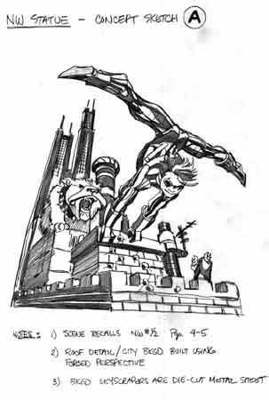
Design A
This is the first image that came to mind! It is reminiscent of the scene in Nightwing #1/2, where Nightwing discovers that the roof-tops in Bludhaven are used for dog runs!I was trying to capture the dangerous personality of the 'Haven as well as the acrobatic personality of Nightwing.
Embellished with bats and bullet holes.
This was a close one, but ultimately it was not chosen because the upside-down figure is harder to recognize and see clearly. In fact, we see mostly his back. It's preferred to see the character's front if you only get one shot!
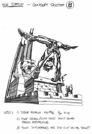
Design B
This is a variant on the idea presented in design A.Note the only difference is in the figure of Nightwing. Here, more "recklessness" is given to our favorite adventurer as he is now going off the roof top upside-down and backwards!
Complete the thought with bats and bullet holes, the ubiquitous 'Haven tags.
This was a close one, but ultimately it was not chosen because the upside-down figure is harder to recognize and see clearly. In fact, I've positioned his head to be pointed almost directly down - and generally, it's not a good idea to obscure the hero's face on his own statue!
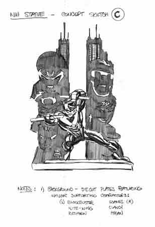
Design C
This is an alternate approach to representing the 'Haven and Nightwing.This time, the 'Haven is represented more thematically, and in addition to buildings, stylized references to the denizens of the city are indicated.
The background suggests the major supporting characters for Nightwing - the good (Clancy and Hogan) and the bad (Blockbuster, Tad as Nite-Wing, Chief Redhorn, and Dudley "Torque" Soames). How come the bad always out-weigh the good??
This design was not chosen because of the complexity of the die-cut metal backgrounds, and too little 'Haven atmosphere.
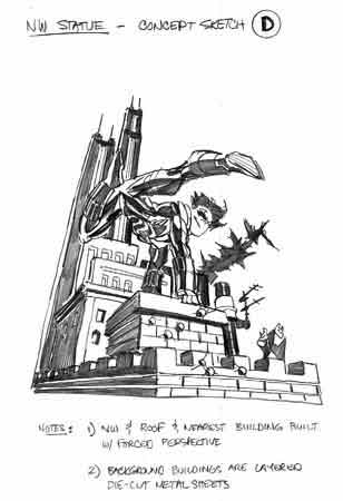
Design D
This is another variant on design A - except the dog is not longer present and Nightwing is in a more upright position.The dog was eliminated because it competed with the Nightwing figure as the focus of our attention. Nightwing is in a more hurdling pose, implying a controlled trek across the rooftop obstacles.
This too was a close one, but it was not chosen because of the complexity of the die-cut metal backgrounds. The figure of Nightwing here is acceptable, although the torso is still pointed down a little more than it should to clearly feature the character.
But the background is pretty solid, giving good depth and detail. So we keep this background (losing the die-cut skyscrapers in the far background).
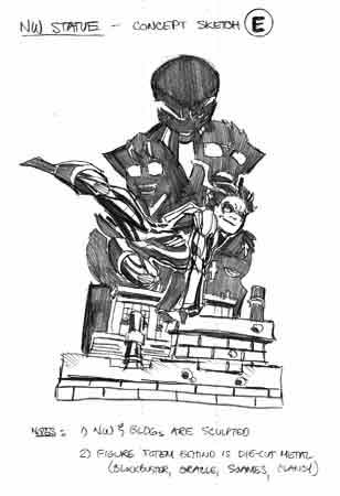
Design E
This is another variant on design A - except the dog is not longer present and Nightwing is in a more upright position and the farthest buildings are replaced by stylized representations of the major supporting characters.The dog was eliminated because it competed with the Nightwing figure as the focus of our attention. Nightwing is in a more hurdling pose, implying a controlled trek across the rooftop obstacles. But this figure's torso is more "open" to view.
This too was a close one, but it was not chosen because of the complexity of the die-cut metal backgrounds. The figure of Nightwing here is the best of the lot, giving us a pretty clear view of the character while maintaining energy and movement in the acrobatic maneuver.
So, we keep this figure and combine it with the background of design D without the tall die-cut skyscrapers..
Onto the Finish Line!
Now that we have selected a concept, let's bring it home!
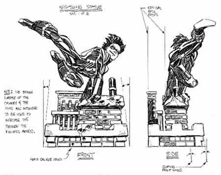
Pencils 1 of 2
This is the resulting composite of background and figure selected in the first step. Extending guidelines from the front view to the right, I figured out the accompanying side view.Embellish the base with bullet holes.
Notice the intentional skewing of the background form to imply a strong perspective feel.
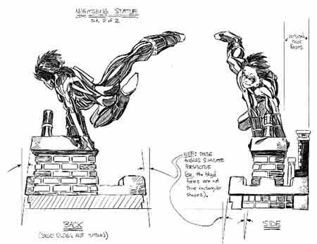
Pencils 2 of 2
This is the resulting composite of background and figure selected in the first step. Extending guidelines from the back view to the right, I figured out the accompanying side view.Embellished with bullet holes.
Notice the intentional skewing of the background form to imply a strong perspective feel.
Finished!
Let's compare the design drawing with the finished work!

Notice the differences to the design drawings - the slight change to the figure, the reduction of detail of the background, the addition of the nameplate.